Hate Speech Vs Free Speech

This work has been commented by 1 curator(s). Read the comments
Title
Hate Speech Vs Free Speech
Headline
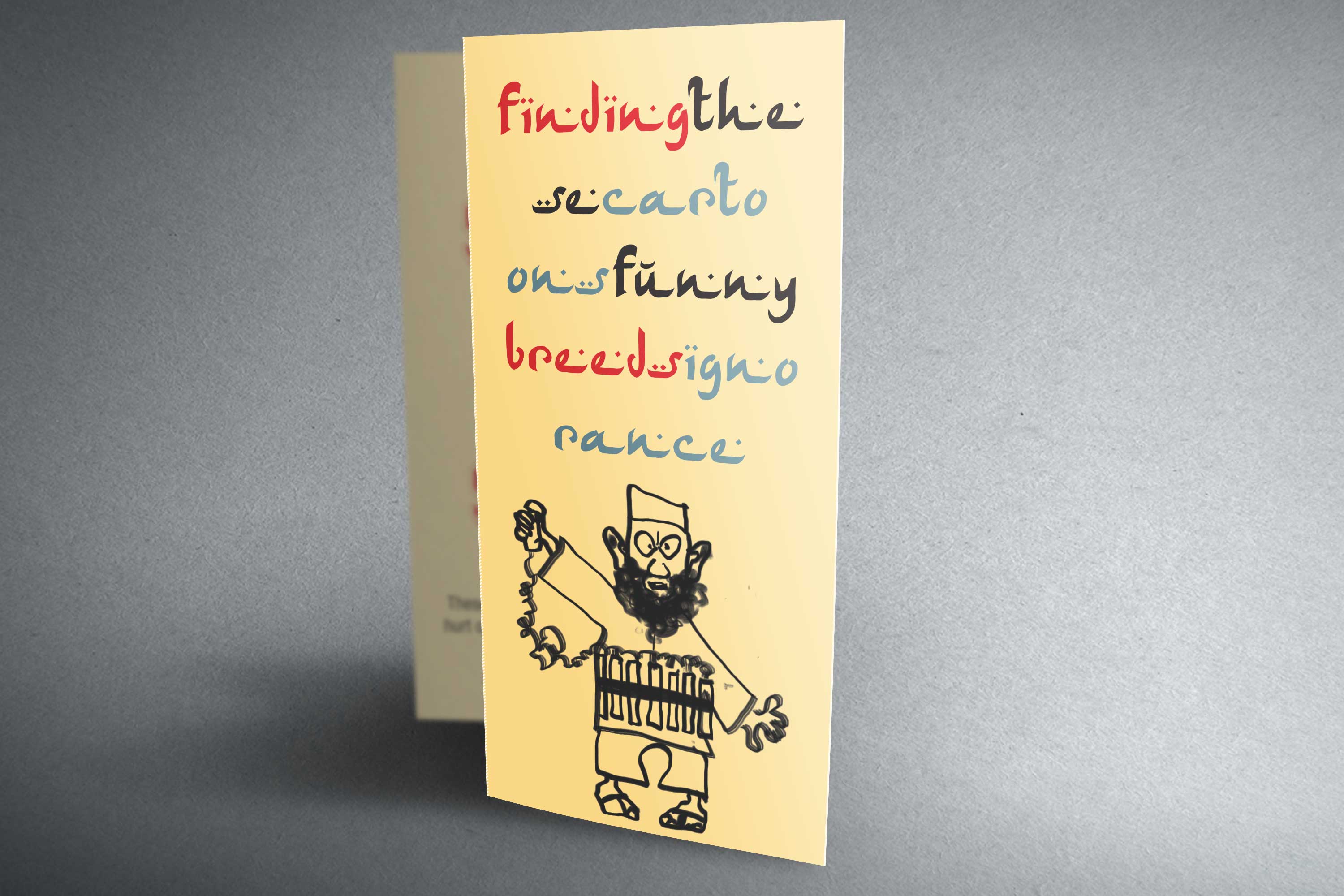
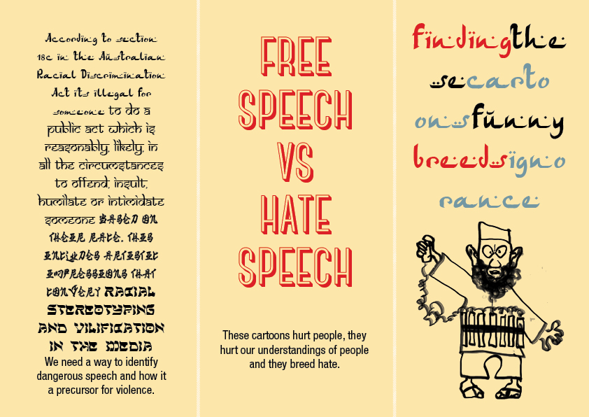
Hate breeds violence
Concept author(s)
Liora Caplan
Concept author year(s) of birth
1981
Concept author(s) contribution
Conception, Design, Layout, Illustration, Copy Writing
Concept author(s) Country
Australia
Designer(s)
Liora Caplan
Designer(s) year(s) of birth
1981
Designer(s) contribution
Conception, Design, Layout, Illustration, Copy Writing
Designer(s) Country
Australia
Friendly Competition
Radical intimacies: dialogue in our times (2014)
Competition category
Visual communication practice
Competition subcategory
static
Competition field
academic
Competition subfield
student
Subfield description
RMIT (Melbourne CBD) Masters of Communication Design
Check out the Radical intimacies: dialogue in our times 2014 outlines of Memefest Friendly competition.
Description of idea
Describe your idea and concept of your work in relation to the festival outlines:
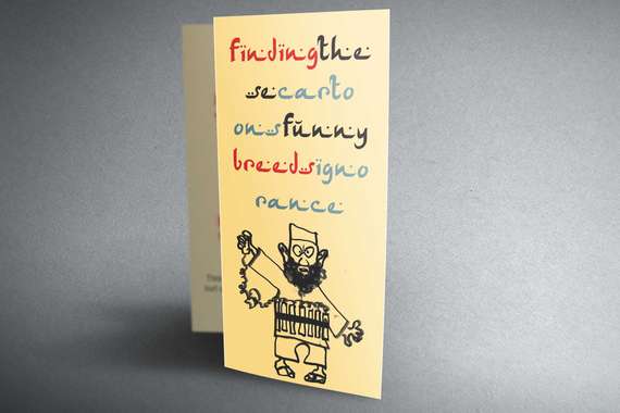
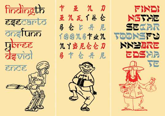
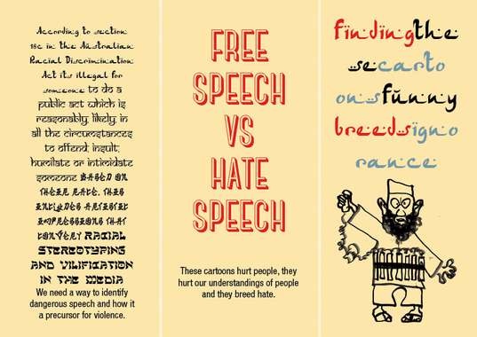
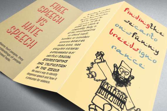
Inflammatory public speech rises steadily before outbreaks of mass violence. We need a way to identify dangerous speech and how it it is failing in our dialogue.
What kind of communication approach do you use?
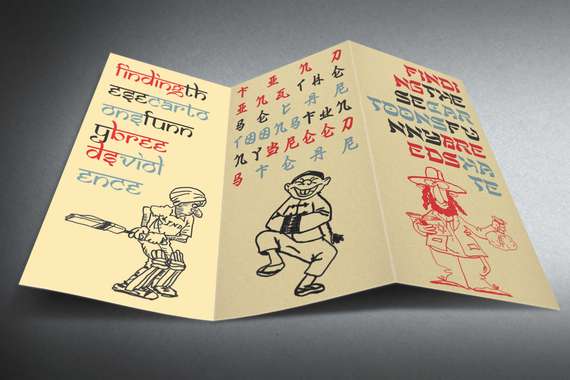
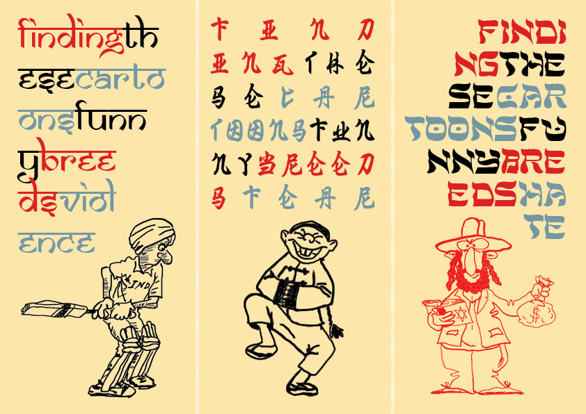
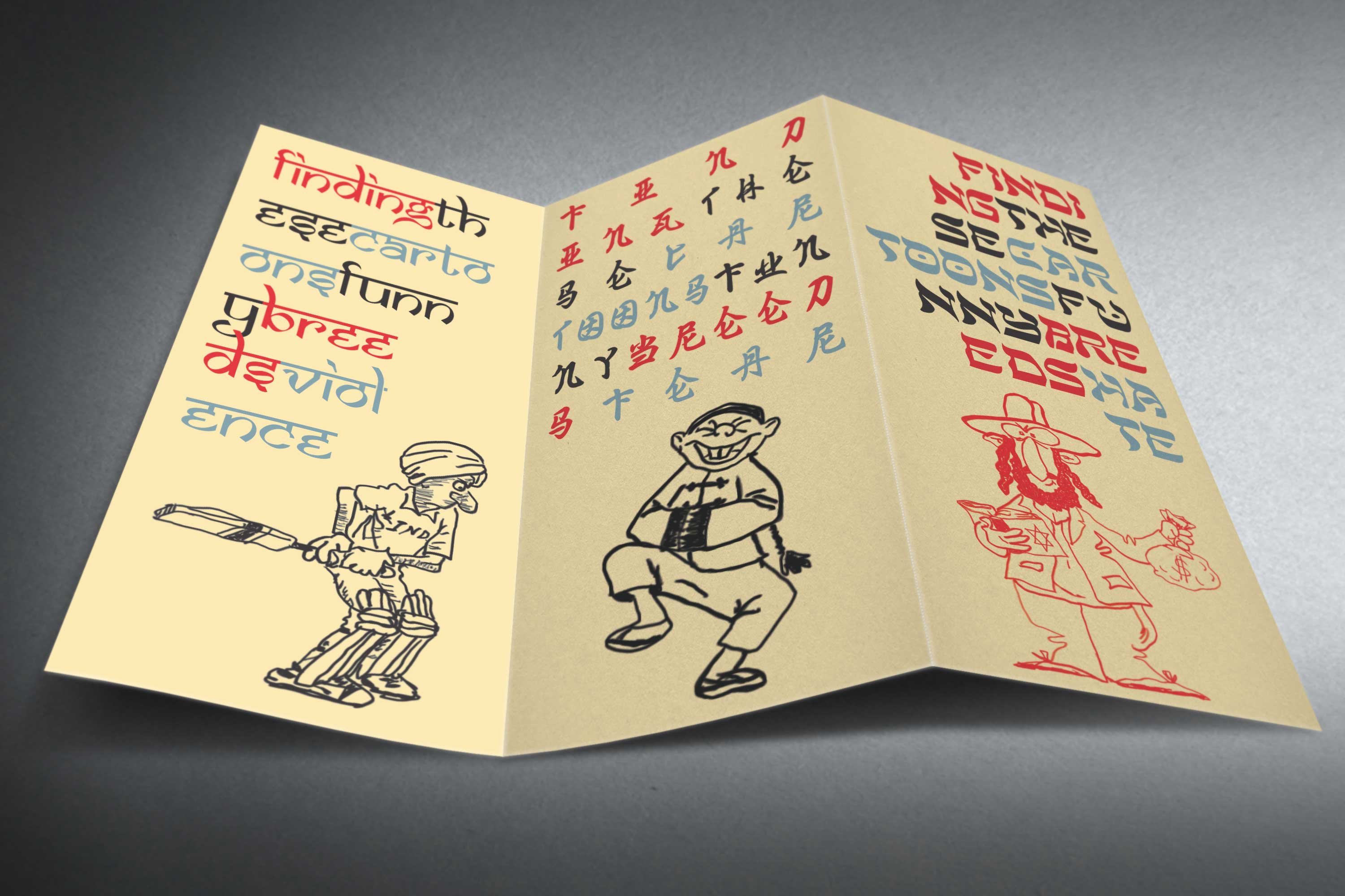
I have utilised a handout brochure to convey my message. The tone is humorous and slightly mocking but with serious connotations.
What are in your opinion concrete benefits to the society because of your communication?
These cartoons are familiar images often displayed in our visual environment especially in the news and media. First reactions are to laugh and not understand the text. Upon further inspection, the viewer realises they can understand the writing. Upon reading, the viewer starts to feel guilty that they shouldn't have laughed at these stereotypes. In raising awareness this will hopefully change people's opinions on what is hate speech and how it can affect our society.
What did you personally learn from creating your submitted work?
I personally learnt the complications of the concept of free speech. I feel saddened that offensive constructs and racism is rife in our media and that we are mostly unaware of the negative effects in understanding other religions and beliefs.
Why is your work, GOOD communication WORK?
It's multilayered in context and relatable. Everyone recognises stereotyping and is victim to it.
Where and how do you intent do implement your work?
I aim to print and hand out these brochures through the community such as train stations, universities, school and parks to raise awareness,
Did your intervention had an effect on other Media. If yes, describe the effect? (Has other media reported on it- how? Were you able to change other media with your work- how?)
no
Curators Comments
Alex Jordan
Dear leora Caplan
first please accept that my english is very bad (not in reading texts but in writing) so I try to give my best but I cannot go in deep grounds with my poor basical expressions.
You have produced a typographically well designed little material and you know also how to use it in public spaces. But why I only see a human bomb caricature? A fanatic islamic self-destroyer. (and to add the caricatural proposal: hoping to come in heaven winning eleven thousend virgins ;-) )
You write too:"offensive constructs and racism is rife in our media and that we are mostly unaware of the negative effects in understanding other religions and beliefs."
Exactly. And I think, there is the starting point to all action as the one you want to do.
What are religions, political ideas, where are their roots, what did history make with that, how do we use today religions in political struggle? Surely not only with explosive belts...
By the way, If you had designed a woman with such a belt, you would have other interpretations, as like for example a palestinian lady whose childen or brothers had been killed by israely bombing on Gaza...
What I try to say is, that you should let the typographical perfection beside and try to find out visual illustrations of all these visual stereotypics which are implanted in peoples brains, those of both the actors and the victims.
The worldwide web is plenty of such pictures...
Take a look and then close the eyes and try to come to some visual traduction, illustration, sign, worlds -and maybe another form and content of your material which really can rock the user.
Simple stickers everywhere can agitate a lot...
I really think too, of you stay with your actual material the pict of an Australian racist (A strong young wafesurfer or his parents, "bormal people" for example) will be stronger for your intention too.
Also try to find out the past of Confucius who is again in vogue.He was not a political lamb...
Comments
11 years, 8 months ago
amitiés
alex
11 years, 8 months ago
11 years, 8 months ago
11 years, 8 months ago
for example: Melbourne Times, 4. 3. 2014
so long in Paris it is half past seven in the morning, I have to go in a printshop. Bye
11 years, 8 months ago
11 years, 8 months ago